Mada za sehemu hiiStatisticsMada 8
Histograms
Is a graphical display of data using bars of different heights. It is similar to bar charts, but a Histogram groups numbers into ranges (intervals). And you decide what range to use.
Drawing Histograms from Frequency Distribution Table
For example; you measure the height of every tree in the orchard in Centimeters (cm) and notice that, their height vary from 100 cm to 340 cm. And you decide to put the data into groups of 50 cm. the results were like here below:
| Height (cm) | Frequency |
|---|---|
| 100 - 150 | 5 |
| 150 - 200 | 30 |
| 200 - 250 | 28 |
| 250 - 300 | 50 |
| 300 - 350 | 10 |
Represent the information above using a histogram.
Solution
| Height (cm) | Class mark | Frequency |
|---|---|---|
| 100 - 150 | 125 | 5 |
| 150 - 200 | 175 | 30 |
| 200 - 250 | 225 | 28 |
| 250 - 300 | 275 | 50 |
| 300 - 350 | 325 | 10 |
| Total | 123 |
**Scale:**vertical scale: 1 cm represents 5 trees horizontal scale: 1 cm represents 50 cm (range of trees heights).
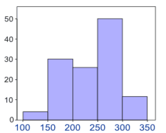
Interpretation of Histograms
The histogram below represents scores achieved by 250 job applicants on a personality profile.
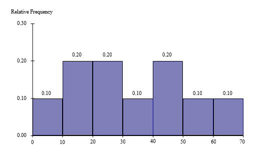
- Percentage of the job applicants scored between 30 and 40 is 10%
- Percentage of the job applicants scored below 60 is 90%
- Job applicants scored between 10 and 30 is 100
Mwalimu
Unasoma somo hili? Niulize nikuelezee chochote kilichomo.
Ingia ili kumuuliza Mwalimu wa AI wa Sonza kuhusu mada hii.
Ingia ili kuulizaMajadiliano
Hakuna maswali bado